Project Description
IGA CANNING BRIDGE
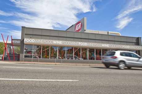
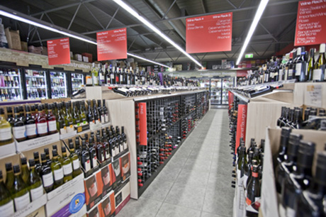
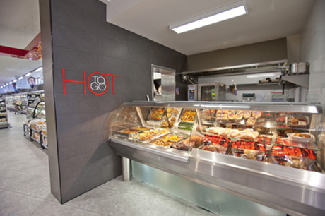
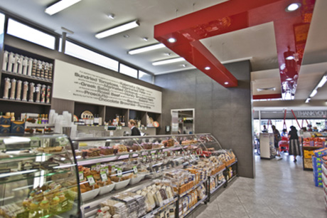
This iconic supermarket has had a long history of alterations that have attempted to make sense of two narrow buildings colliding at an awkward angle on an awkward site. Characterised by bottle necks and poor sight lines the solution has been to peel away redundant layers and introduce a few strong elements to tie the spaces together as well as help explain the bones of the building. The exterior equally struggled to present itself as anything other than a collection of bits thrown together but has been resolved with paint and graphics using the various forms as a canvas for text and colour.
Image Gallery


